Here are websites that have a similar concept to the Museum of Websites, and the reasons why I couldn’t rely on them as much as I would have liked to for design inspiration.
Curated.Design
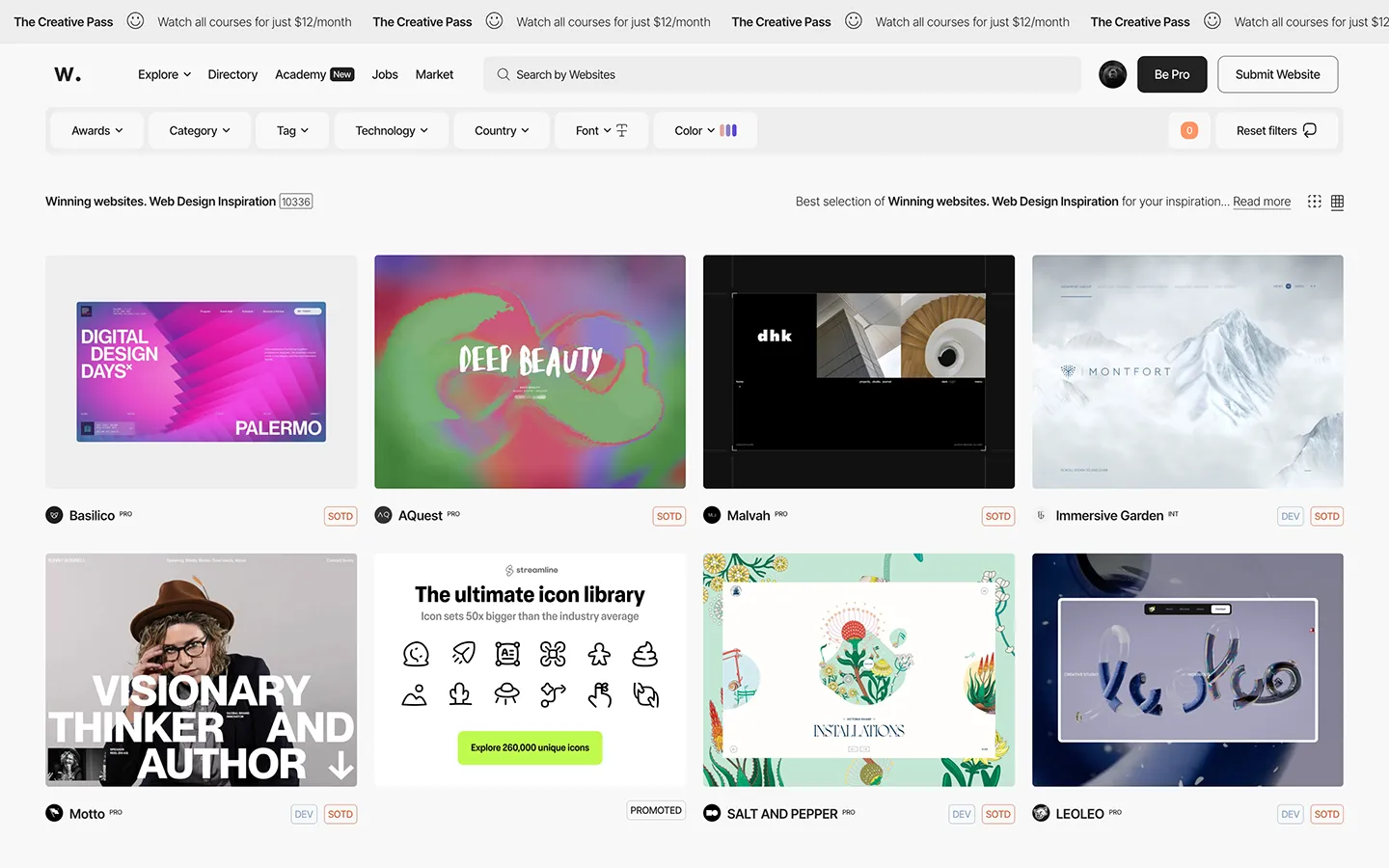
Created by the Craftwork team in Bangkok, Thailand. This website is the closests to my vision of what I wanted to build, and I have a ton of respect for the team that made it! 😍 The execution is so beautifully done and I ended up borrowing heavily from it.
What I love in particular:
- The filters (or at least some of them) always remain accessible in the left sidebar while scrolling through the gallery.
- The video previews of each website.
- The ability to view more about a website without changing pages.
- The ability to save websites that you like.
- The clean UI and screenshots that put the focus on the websites being featured.
My only complaints are that:
- It is missing many categories I’m interested in such as personal portfolios, blogs, travel, politics, real estate, small businesses, etc.
- The style filters are also not as comprehensive as I’d like them to be.
- The lack of a search option.
- The number of views and saves for each website are not shown.
- The site has had a lot of downtime lately.
BestWebsite.Gallery
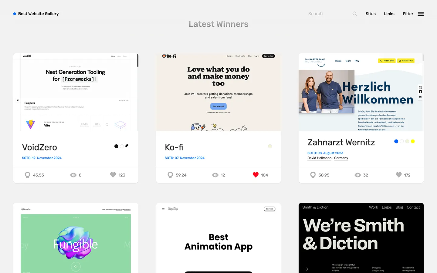
Created and run by one person, David Hellmann, who is both a web designer and developer. “It’s simply my visual bookmark collection.” I can strongly relate to this, and it mirrors my motivation for creating the Museum of Websites.
BestWebsite.Gallery is my second favorite gallery after Curated.Design.
I like:
- The clean presentation.
- The search function.
- The views and likes counters.
- The clever use of a ref tag at the end of every external site link (
?ref=bestwebsite.gallery), so that other website admins can easily learn about his site.
What I don’t like:
- The filters are mostly focused on the tech stacks used rather than on the design or use case; there is no way to find sites of a particular category, and the style filters are very limited.
- There is too much focus on naming a “site of the day” (SOTD), and this is not useful information.
- There is no user authentication for likes, and so I’m not sure how reliable they are.
- There doesn’t seem to be any way to unlike a site if you accidentally like it.
Mobbin.com
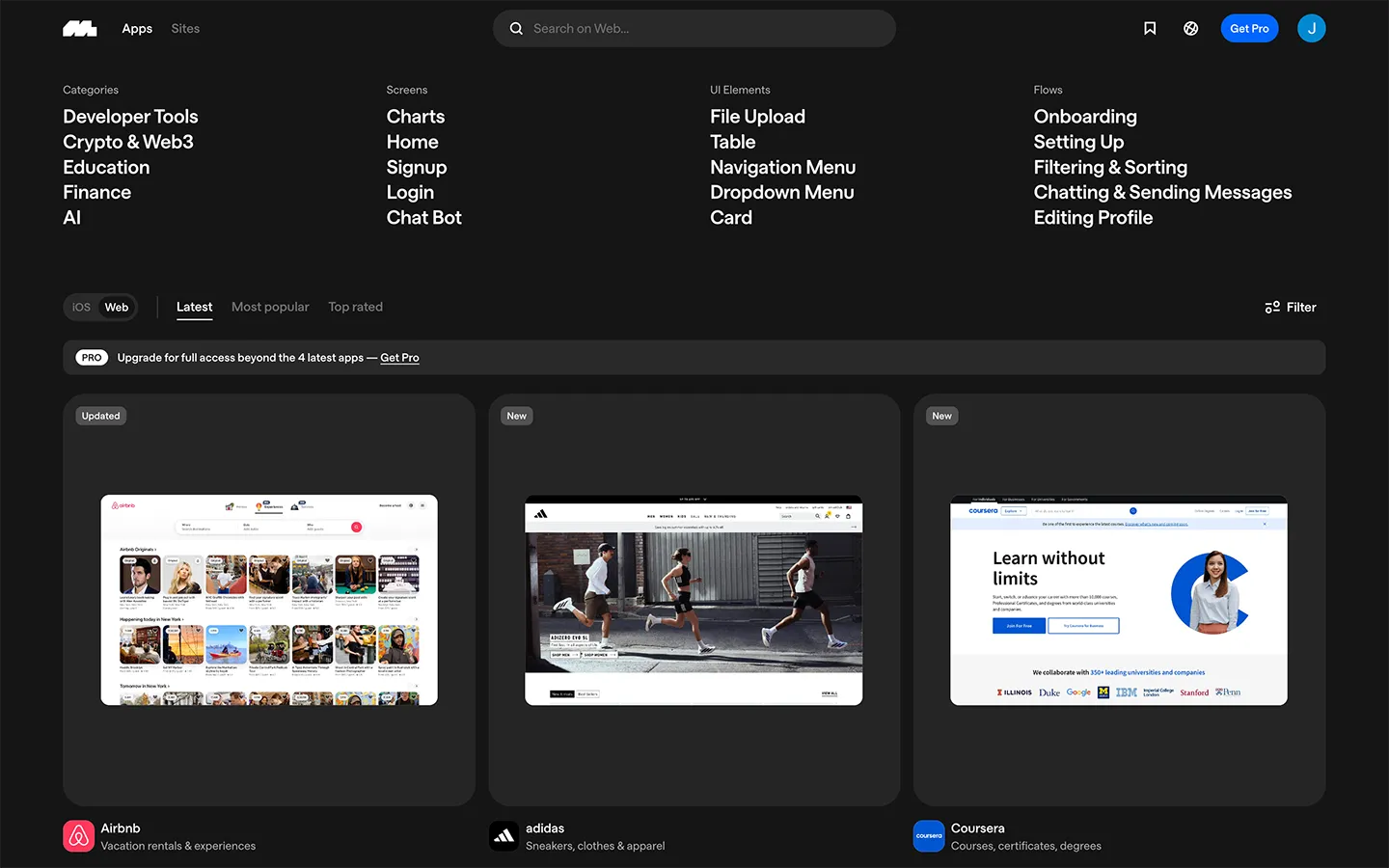
Mobbin is the most comprehensive website for design inspiration that I could find. They have over 100,000 screenshots and 400,000 users. For every website featured, they put great effort into capturing all the pages, UI elements, and user flows for both web and mobile. They also track design changes to the websites and allow you to see older versions.
All this work comes at a cost though. To take full advantage of all the features you’ll need to buy a yearly or quarterly plan.
Another neat feature that they have is that users can save their favorite sites and screenshots, create collections, and share them.
Awwwards.com
Awwwards is like the fashion walkway of the website world. They seem to prioritize designs that are very unusual, far-out, and animation-heavy at the cost of practicality, usability, and accessibility.
Many of their featured websites remind me of ridiculous clothing made by prestigious fashion designers that no one would wear in real life.
Occasionally I’ll find a good piece of web design inspiration there, but it’s mostly not useful.
Other issues I have with this website:
- It can be hard to decipher how the featured websites actually look like, because their screenshots and videos recordings often include random backgrounds from their desktop. Or sometimes they show the website by taking a photo of the laptop or mobile device that is displaying it, and include a random real-life background behind the device. Basically, there is a lack of consistency in how websites are shown as well as too much noise and clutter.
- Odd UI choices like a massive font that takes up half the page just to show the website title.
- Just like BestWebsite.Gallery, they focus too much on picking a Site of the Day (SOTD), as well as a Site of the Month (SOTM), and Site of the Year (SOTY).
WebbyAwards.com
WebbyAwards is like the Emmies of the website world. And compared to Awwwards.com, WebbyAwards tends to do a better job at balancing unique designs with usability.
Unfortunately, the WebbyAward’s own website is frustrating to navigate, and they only show one small screenshot of each site they feature. The only video is of the designer giving a 5 word speech, and the link to visit the site is burried near the bottom of each page.
Showcase sites
Many web frameworks will have a showcase page. You can find nice inspiration on these pages, but the issue is that they often lack any categorization or filtering, and are by definition limited to the frameworks they are built on.
Template sites
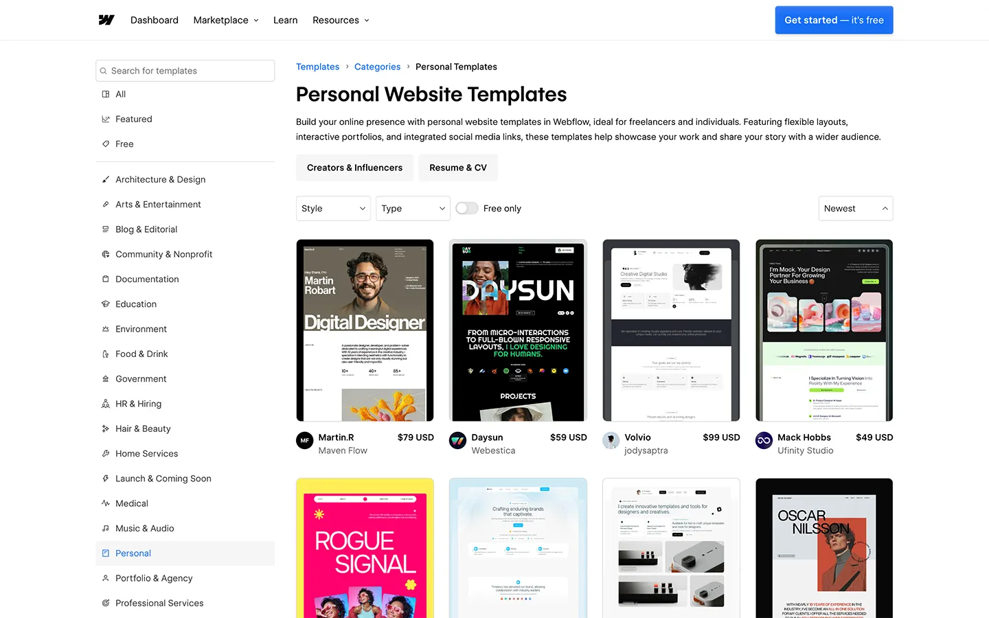
Template sites — such as for Ghost, SquareSpace, Wix, Wordpress, etc — are another good source of inspiration.
In particular, Webflow has some of the best website categorization options that I’ve seen.